A Good Practice Guide
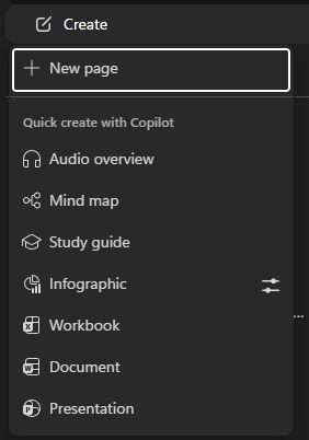
The biggest mistake people make with Copilot Notebooks is treating them as a place to write a report. Or that they are anything like a OneNote notebook page (even though they are available in OneNote). I made both mistakes. The most effective approach is to treat them as a knowledge curation and synthesis workspace. Load up your Copilot notebook with links to web pages, add documents, shared content on SharePoint etc. Add/create additional content to the notebook using the Create button. (Note the setting icon next to Infographics – we’ll come back to that).
High-level workflow of Copilot Notebooks:
- Create a new notebook.
- Add Microsoft 365 files, Copilot pages, and other types of references.
- Create a page to start to pull your content and topics together
- Ask Copilot questions about the content in your notebook.
- Get focused answers from Copilot that are based only on the references you’ve added to your notebook.
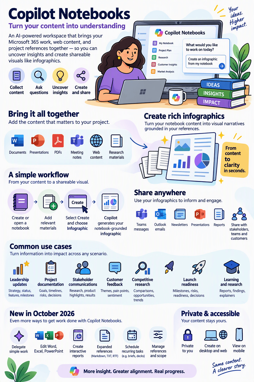
In this article I’m going to focus solely on the neat new Infographic capability. I’ve used it quite a bit now and everyone has been suitably impressed. It crams a LOT of information into one image, which has had the secondary benefit of massively reducing the number of slides I use in PowerPoint presentations (and that’s very good thing).
For high-quality infographics, the notebook should contain:
- Source material (research, frameworks, standards).
- Structured thinking in pages (your analysis and categorisation).
- The target model (the infographic architecture itself).
When used this way, the Infographic feature can create much richer outputs because it is drawing from an organised body of evidence rather than a collection of unrelated documents.
The Objective
Suppose you want to create a rich executive infographic that explains the Communication Competency from the Microsoft 365 Maturity Model.
Rather than creating a simple summary, the goal in this case is to produce an infographic that clearly shows:
- What the Communication Competency is
- Why it matters
- The business outcomes it delivers
- The progression from Level 100 to Level 500
- The characteristics of each maturity level
- Assessment questions
- Recommendations for progression
- Connections to wider Microsoft 365 adoption and transformation
The infographic should be suitable for a wide range of people, including CIOs, Comms Directors, Change Managers, Microsoft 365 Consultants, Adoption Specialists & Executive Sponsors. The Copilot notebook is the place you pull together the authoritative knowledge on the subject, and from which the infographic is generated.
Creating a great infographic
It’s not really enough to press the Infographic button. You ought to give Copilot some guidance on what you want in it through a series of prompts. This is my process for this topic area.
Step 1: Create a Dedicated Notebook
Call it: M365 Maturity Model – Communication Competency
Avoid combining multiple competencies in a single notebook initially. For example, don’t use: M365 Maturity Model until the individual competency notebooks have been developed. (I made that mistake too)
until the individual competency notebooks have been developed.
A focused notebook provides significantly better infographic results.
Step 2: Configure the Notebook Instructions
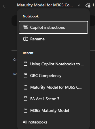
This sets out the riles for this particular notebook-Copilot interaction, and lets you set some rules for Copilot to follow when it generates pages and overviews.
Example:
Assume the audience consists of CIOs, IT Directors, Communications managers and execs Microsoft 365 consultants and organisational change leaders.
Prioritise information from the Microsoft 365 Maturity Model.
Present information in infographic-friendly formats including:
– maturity levels
– progression models
– roadmaps
– business outcomes
– capability assessments
– executive summaries
Avoid marketing language. Explain how communication maturity supports organisational transformation. When visualising maturity, clearly show progression from Level 100 to Level 500. Recommend visual structures where appropriate
See https://support.microsoft.com/en-us/microsoft-365-copilot/provide-custom-instructions-for-your-microsoft-365-copilot-notebook for more guidance.
Step 3: Add the Authoritative Source Material
The first item added to the notebook should be the official Communication Competency page: Microsoft 365 Maturity Model – Communication Competency. This becomes the canonical source.
Avoid starting with blog posts and third-party interpretations. I recommend that the first reference added to the notebook is the most important content, in this case the official Communication Competency page, so it becomes the primary authoritative source for later synthesis
Step 4: Create a Competency Summary Page
Create a new page from the Create button on the left. Then pose a question to Copilot in the chat on the left to fill out the page you just created, using the following prompt. If you have the page open your prompt should fill in the page automatically. You can also use the Add to page option in the Chat ellipsis
Ask Copilot:
Summarise the Communication Competency using only information from the official Microsoft 365 Maturity Model source.
Include:
– purpose
– goals
– business benefits
– expected outcomes
– key themes
Save this as:
Communication Competency Summary
This page becomes the executive-level explanation used repeatedly throughout the infographic.
Step 5: Create a Maturity Levels Page
Create a new page: Communication Maturity Levels
Prompt:
Using the official maturity model information, explain the communication characteristics of:
Level 100
Level 200
Level 300
Level 400
Level 500
Present in a concise table suitable for infographic use.
This page becomes one of the most important sources for infographic generation. A good infographic requires explicit maturity progression.
Step 6: Create a Business Outcomes Page
Most maturity infographics are too technology-focused.
Create a new page: Communication Business Outcomes
Prompt:
Identify the organisational and business outcomes delivered by mature communication practices.
Categorise as:
People
Process
Technology
Culture
Business Value
This allows the infographic to connect communication activities with meaningful organisational benefits.
Step 7: Create an Assessment Criteria Page
Create: Communication Assessment Framework
Prompt:
Extract all assessment criteria and indicators from the Communication Competency.
Organise them by maturity level.
Highlight indicators that distinguish one level from the next.
This is often overlooked but dramatically improves infographic quality.
Step 8: Create a Progression Roadmap Page
Create a new page: Communication Roadmap
Executives frequently ask, “What do we need to do next?”. This roadmap element answers that question.
Prompt:
Create a roadmap showing what an organisation should do to move from:
Level 100 to 200
Level 200 to 300
Level 300 to 400
Level 400 to 500
Use only information contained within the maturity model.
This content often becomes a separate infographic section.
Step 9: Create a Visual Structure Page
Create a new page: Communication Infographic Architecture
Define what you want Copilot to build.
Example:
Primary layout: Five-level maturity ladder.
Section 1: Communication competency overview.
Section 2: Business outcomes.
Section 3: Level 100–500 progression.
Section 4: Key assessment criteria.
Section 5: Recommended next steps.
Audience: Executive leadership.
Style: Microsoft-inspired, high information density, presentation quality.
This page effectively acts as the infographic design brief.
Step 10: Perform a Gap Analysis
You should now have half a dozen pages of AI created content from your source material. It might be wise to review them. Before generating the infographic, ask:
Review all notebook content.
Identify:
– missing information
– duplicated information
– areas where maturity progression is unclear
– places where more evidence is required
– content that may be difficult to visualise
Recommend improvements.
This serves as a quality-control step.
Step 11: Generate a Final Infographic Dataset
If we are happy with our infographic definition we can now create a page called: Final Communication Infographic Dataset
Prompt:
Using all notebook content, create a single infographic-ready dataset.
Include:
– competency summary
– business outcomes
– maturity level descriptions
– progression roadmaps
– key metrics
– assessment indicators
Use concise, presentation-ready language.
This page should act as a primary source for generating the infographic.
Step 12: Generate the Infographic
Example prompt:
Create an infographic based on the Final Communication Infographic Dataset.
Requirements:
– Microsoft 365 Communication Competency
– Show maturity progression from Level 100 to Level 500
– Include organisational outcomes
– Include roadmap recommendations
– Executive audience
– High information density
– Suitable for PowerPoint and A3 print
– Minimal decorative elements
– Prioritise readability
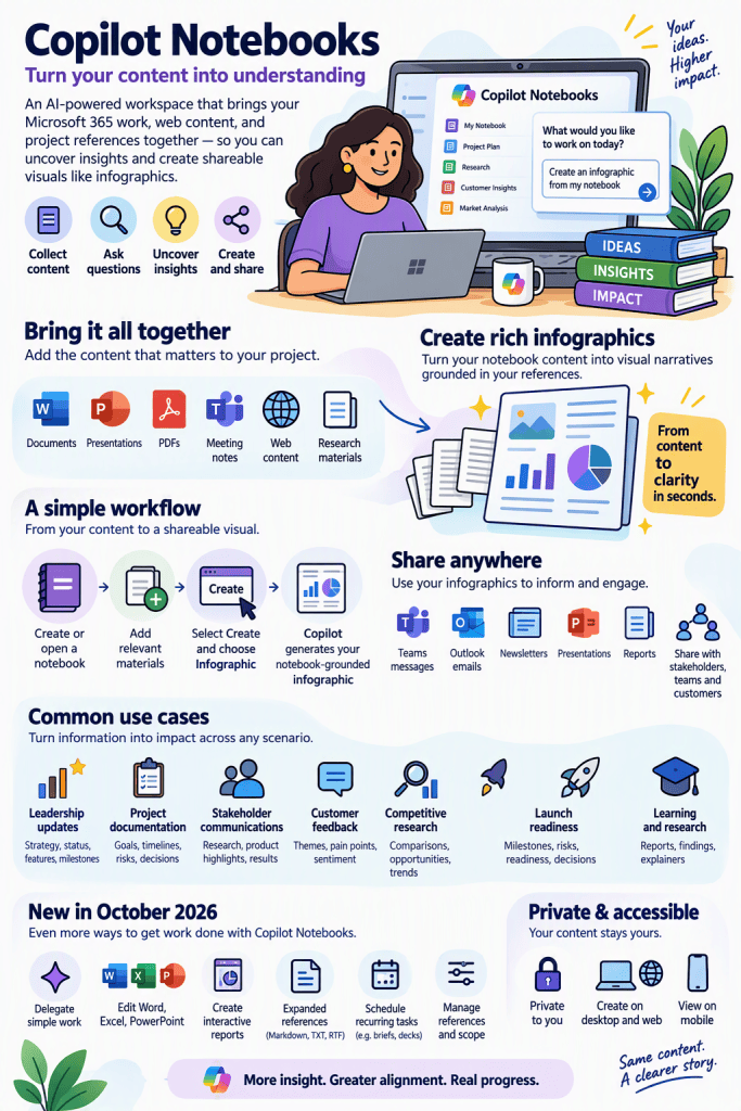
And these are the kings of result you can expect. Remember, it’s an LLM; even with guidance the results will be different every time. As you can see.
Of course, you could just load the content, steps 1-3 and hope for the best. If you are in a hurry that’s probably good enough a lot of the time
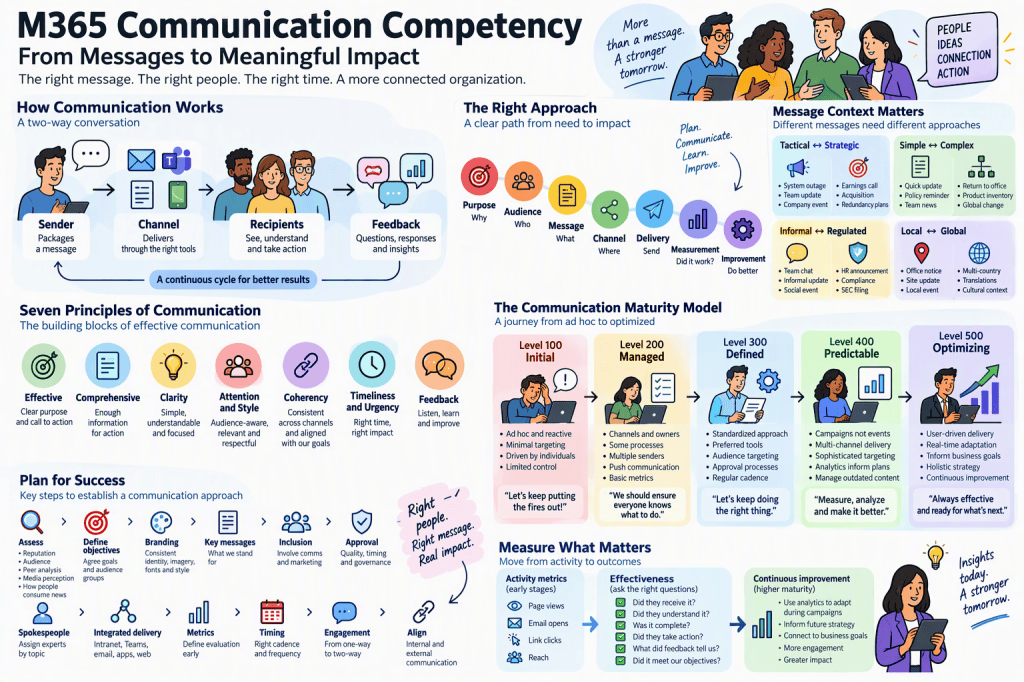
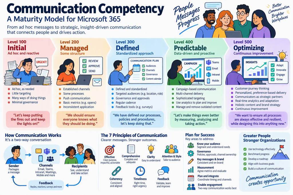
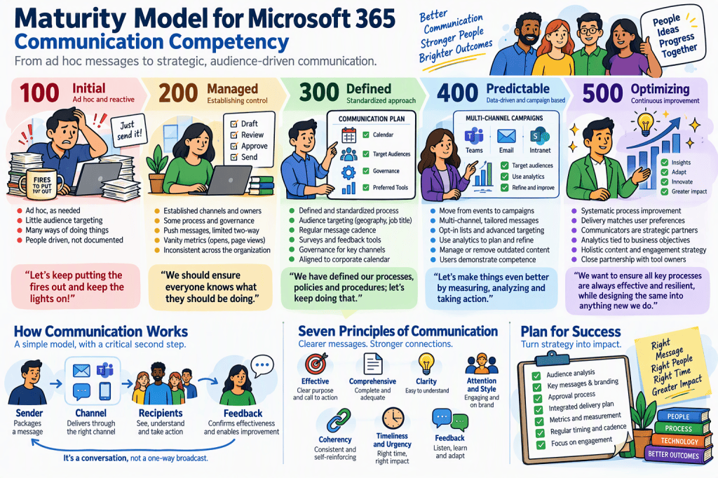
My standard pattern for Maturity Model Infographics
For a competency such as Communication, I would structure the notebook like this:
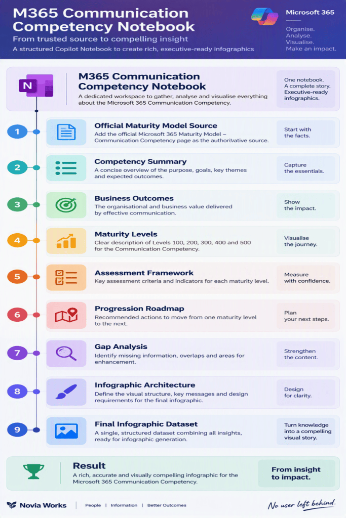
The key insight is that the notebook should not merely contain the official Communication Competency page. It should progressively transform that source material into increasingly structured, visual, infographic-ready knowledge. By the time you ask Copilot to create the infographic, the notebook already contains the competency model, executive narrative, roadmap, assessment framework and visual brief, allowing the infographic generator to produce a much richer and more useful result.
And yes, the Notebook pages do seem to be Loop components; they appear in the Loop portal and can be copied from there.
Limitations
- Infographics are private to you, even when created from a shared notebook.
- Copilot Notebooks Infographics are only available on desktop and web in in the Microsoft Copilot app and OneNote. You can ask Copilot to generate an infographic elsewhere, but it will lack the richness of this tool. On Android and iOS OneNote and M365 apps, you can consume/preview the generated infographics, but not create tehm.
- Generated outputs reflect the content available in your notebook at the time of creation, and the quality and completeness of an infographic depend on the quality, and relevance of notebook sources.
Also beware of the following, that can create a confused and low value notebook:
- Too many unrelated references
- Multiple maturity competencies in one notebook
- No authoritative source
- Generating infographics before synthesis pages exist
- Relying entirely on third-party blogs
Enhancements
The October 2026 update to Copilot Notebooks also introduced:
- model selection within notebooks
- notebook-only grounding versus broader work-and-web grounding
- automated recurring tasks
- expanded reference types like Markdown, TXT and RTF files
Links
https://support.microsoft.com/en-us/microsoft-365-copilot/infographics-copilot-notebooks
https://support.microsoft.com/en-us/microsoft-365-copilot/how-microsoft-365-copilot-notebooks-works
Personal Infographic
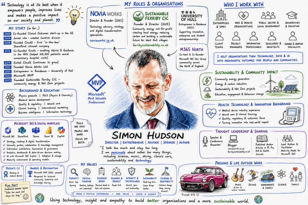
As an aside, this is my other favourite thing, the WorkIQ Persona Sketch
As the Github description says:
“This prompt is designed to help you better understand and visualise your work. Depending on your data, generated outputs may include references to people you work with, projects, customers, teams, or other organisational details.”
It’s built/maintained by one of my favourite community people, Vesa Juvonen. It taps into the Work IQ part of the Microsoft Graph, pulls loads of information about you from it and turns it into a personal infographic. It’s now my default slide deck intro/sign off slide. And it’s as simple to use as pasting prompt (assuming you have a full M365 and Copilot licence):
Instructions 📝
- Open Copilot in your Microsoft 365 app (for example, Teams or Copilot Chat) with WorkIQ enabled in tenant.
- Copy the prompt from the Prompt section, or my copy below. Tweak it if you want.
- Paste it into Copilot and run it.
- Review the generated persona sketch.
- You can always use Copilot to change some things in the resulting image if you need to.
- Don’t forget to run it again sometimes, to see who else you have become.
Create a photorealistic image in a clean cartoon whiteboard sketch style that visualises my work life. Include what I do, who I work with, my role, my values and what's important to me. I've attached a headshot so you can guide the sketch of me at the center. Ground your research in Work IQ and the public profile for me on LinkedIn. The graphic should be rich in information. For the avatars of the people I work with, avoid guessing and put a generic icon in place or find their actual profile pictures.